6 Simple Billboard Design Tips To Maximize Visibility
Để không bị chìm nghỉm giữa đám đông, thiết kế biển quảng cáo là yếu tố “quan trọng” mà các doanh nghiệp phải chú ý! Cho dù vị trí đặt biển quảng cáo có đắt đỏ đến đâu, kích thước biển quảng cáo lớn cỡ nào, nếu nội dung và hình ảnh bên trong không ấn tượng, quá nhạt nhẽo, nhàm chán hoặc khó hiểu, nó có thể dẫn đến thất bại đáng tiếc.
Tại sao chúng ta nên chú trọng đến thiết kế bảng quảng cáo?
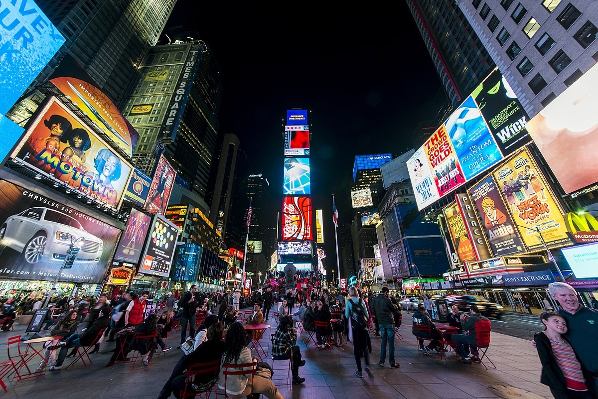
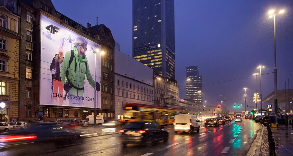
Biển quảng cáo là loại biển quảng cáo gắn trên tường, được đặt ở mặt trước hoặc bên hông các tòa nhà cao tầng. Chúng được sử dụng phổ biến nhất ở khu vực đô thị, xuất hiện dày đặc ở trung tâm thành phố, tiếp cận hàng triệu người xem mỗi ngày. Tuy nhiên, chính vì vậy, tính cạnh tranh của loại biển quảng cáo này rất cao.
Khi bạn bước ra khỏi nhà, trên đường đến trường, nơi làm việc hoặc đi dạo, bạn sẽ dễ dàng bắt gặp các biển quảng cáo. Ngay cả ở những vị trí đắt đỏ, đôi khi người tiêu dùng vẫn cảm thấy choáng ngợp trước số lượng biển quảng cáo khổng lồ. Do đó, nếu bạn không có thiết kế biển quảng cáo thực sự nổi bật, quảng cáo của bạn có thể dễ dàng bị lẫn vào đám đông, bị khách hàng bỏ qua hoặc thậm chí bị phớt lờ.
Theo thống kê, trung bình mỗi khách hàng chỉ dành không quá 5 giây để xem quảng cáo ngoài trời. Do đó, thiết kế bảng quảng cáo cần phải có khả năng tạo ấn tượng nhanh chóng và mạnh mẽ, giúp người xem nhanh chóng ghi nhớ thông điệp mà doanh nghiệp muốn truyền tải. Các thương hiệu cần tận dụng tối đa khoảng thời gian ngắn ngủi này để có thể lưu lại nhiều nội dung nhất trong tâm trí khách hàng.
Mặc dù quảng cáo ngoài trời nói chung và biển quảng cáo nói riêng là những hình thức quảng cáo dài hạn, cần thời gian để thấy được hiệu quả. Tuy nhiên, nếu thiết kế biển quảng cáo không tạo được ấn tượng ngay từ lần đầu tiên, sẽ rất khó để tạo được ấn tượng trong những lần tiếp theo và khiến khách hàng nhớ đến chúng.
Làm thế nào để thiết kế bảng quảng cáo?
Thiết kế bảng quảng cáo cũng được thực hiện trên các phần mềm quen thuộc. Một số phần mềm thiết kế bảng quảng cáo thường được sử dụng bao gồm: Photoshop, AI,…
Tuy nhiên, việc thiết kế bảng quảng cáo trực tuyến và căn chỉnh khi hiển thị trên các bảng quảng cáo lớn đòi hỏi những tính toán cẩn thận. Thông thường, nhóm thiết kế sẽ cần tạo bản vẽ CAD của bảng quảng cáo và phối cảnh thực tế để có được cái nhìn tổng quan hiển thị chính xác nhất.
Do đó, các doanh nghiệp nên tập trung đầu tư vào thiết kế bảng quảng cáo. Bên cạnh các nhà thiết kế sáng tạo, bạn cũng nên tìm kiếm các nhà cung cấp dịch vụ chuyên nghiệp, giàu kinh nghiệm để được hỗ trợ thêm trong việc chỉnh sửa thiết kế trên thực tế.

6 mẹo đơn giản để thiết kế bảng quảng cáo ấn tượng
Không có tiêu chuẩn hay công thức nào cho sự sáng tạo trong thiết kế biển quảng cáo. Nhưng để tối đa hóa hiệu quả tiếp nhận, dưới đây là 6 lưu ý mà các thương hiệu cần nhớ khi thiết kế biển quảng cáo!
1. Thông điệp đáng nhớ
Đừng chơi chữ, đừng khiến người xem phải suy nghĩ quá nhiều vì rất có thể họ sẽ bỏ qua quảng cáo của bạn. Trên thiết kế bảng quảng cáo, hãy trình bày thông điệp một cách ngắn gọn, đơn giản, dễ hiểu và đi thẳng vào vấn đề. Loại bỏ các thuật ngữ chuyên ngành để tránh gây nhầm lẫn!
2. Độ dài tin nhắn
Khi thiết kế biển quảng cáo, những thông điệp ngắn gọn sẽ dễ nhớ và hiệu quả hơn. Trên thực tế, hầu hết người xem sẽ ngừng đọc sau khoảng năm hoặc sáu từ. Mục tiêu của bạn là sắp xếp từng từ trong quảng cáo để truyền tải thông điệp cốt lõi thay vì tập trung vào việc thêm quá nhiều chi tiết. Để tạo ấn tượng mạnh, hãy dành thời gian lên kế hoạch, chỉnh sửa và viết lại thông điệp sao cho ngắn gọn nhất có thể, lý tưởng nhất là không quá bảy từ.

3. Thiết kế bảng quảng cáo ảnh
Yếu tố cốt lõi của thiết kế biển quảng cáo chắc chắn là trải nghiệm thị giác. Cách tốt nhất là chọn một hình ảnh hoặc yếu tố đồ họa thu hút sự chú ý của người xem và củng cố thông điệp chính của quảng cáo. Khi hình ảnh và văn bản được sắp xếp hài hòa, người xem sẽ nhận được thông điệp rõ ràng và ngay lập tức chỉ trong vài giây.
4. Lựa chọn màu sắc
Khi thiết kế biển quảng cáo, màu sắc là một yếu tố quan trọng. Điều quan trọng là phải chọn màu nền và phông chữ có độ tương phản đủ để thông điệp của bạn dễ đọc vào bất kỳ thời điểm nào trong ngày. Tốt nhất là nên tránh nền trắng sáng, vì nó có thể gây mất tập trung cho người lái xe vào ban đêm.
Ngoài ra, việc lựa chọn màu sắc cũng cần được cân nhắc sao cho phù hợp với màu sắc thương hiệu, mục đích và sản phẩm được quảng cáo. Ví dụ, các biển quảng cáo Tết thường gắn liền với màu đỏ, tượng trưng cho lời chúc mừng, mang lại may mắn và thu hút sự chú ý của người qua đường.
5. Kích thước và kiểu chữ
Khi chọn phông chữ, đừng quá cầu kỳ. Tốt nhất là nên chọn phông chữ lớn và đậm, tránh những phông chữ quá phức tạp khó đọc.
Dù bạn chọn phông chữ nào, tốt nhất là nên sử dụng một phông chữ duy nhất cho quảng cáo của mình. Bạn có thể thay đổi kích thước hoặc độ đậm của phông chữ để tạo điểm nhấn khác biệt trên bảng quảng cáo.
6. Thông tin liên hệ
Mục đích chính của thiết kế bảng quảng cáo không phải là để liên hệ với công ty của bạn, nhưng điều này không nên bị bỏ qua! Các doanh nghiệp có thể lựa chọn các phương pháp quảng cáo đơn giản, nhanh chóng thông qua trang web và Fanpage, đôi khi hiệu quả hơn cả một dãy số điện thoại.
Kết luận
Việc chia sẻ kinh nghiệm thiết kế bảng quảng cáo trên từ Sixth Sense Media hy vọng sẽ mang lại những thông tin thiết thực và hữu ích cho các doanh nghiệp. Mặc dù bảng quảng cáo kỹ thuật số đang bắt đầu phổ biến, nhưng riêng tại Việt Nam, bảng quảng cáo truyền thống vẫn giữ vị trí vững chắc và sẽ tiếp tục phát triển trong tương lai xa!
Công ty Cổ phần Truyền thông Quảng cáo Ngoài trời – SIXTH SENSE MEDIA
Văn phòng Hà Nội:
Địa chỉ: Tầng 3, số 6 Nguyễn Công Trứ, Hai Bà Trưng, Hà Nội
Điện thoại: (0243) 237 3692
Đường dây nóng: 0982 513 898
Văn phòng Thành phố Hồ Chí Minh:
Địa chỉ: 459 Tô Văn Hạnh, Phường 12, Quận 10, TP.HCM
Điện thoại: (08) 88 589 489
Đường dây nóng: 0934 519 516
Email: contact@ssm.vn
If you want to quickly preview PRODUCT IMAGES for ADVERTISING in the most visual and vivid way, SSM is giving you a free demo marquette!